Case Study
Quench California
Imagine a day without clean drinking water. It’s not just a distant worry—it has happened in past California droughts. Taps ran dry, jobs were lost, crops failed, and food prices soared. Water scarcity is a real and urgent issue with serious consequences. To combat this, California needs to expand and upgrade its statewide and local water infrastructure.
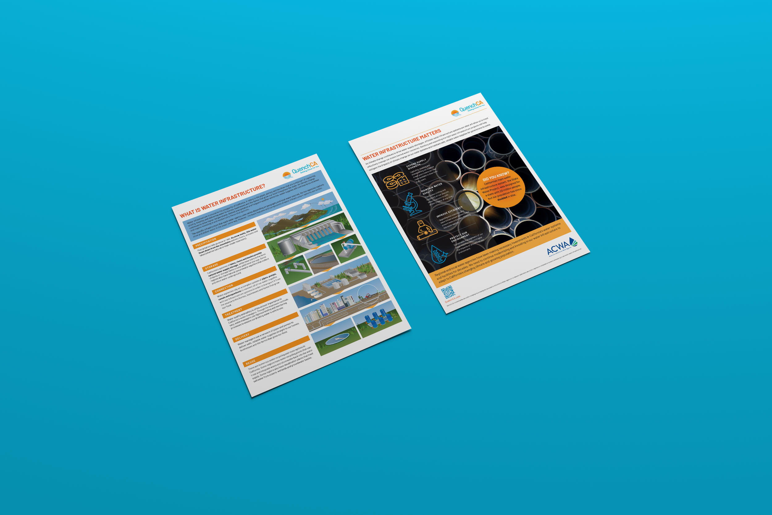
Approached by the Association of California Water Agencies to help educate Californians about the importance and positive benefits of investing in our state’s water infrastructure, we needed to deliver a campaign that felt both urgent and approachable. That campaign was QuenchCA, a play on the goal of quenching California’s ever-present thirst for water.
The branding for QuenchCA needed to be warm and welcoming: a setting California sun over bright blue water. The typeface, Barlow, a type family inspired by California license plates and street signs, chosen to deliver a bit of familiarity to Californians.
To support that brand we launched a social media and advertising campaign to drive people to a user-friendly website that teaches the importance of water infrastructure and highlights projects throughout the state. In addition, we produced a compelling and engaging video series called “Building Water for You” that features real Californians talking about how water supports their businesses, protects California’s food supply and sustains our cities.
With a mix of compelling storytelling and a strong visual identity, the brand effectively turned water infrastructure into a movement that feels both accessible and necessary.


